The feats of Klee
By John Hendry
The artists who blazed their way through the first half of the twentieth century have become as familiar to us today as the Impressionists who dominated the previous half-century. Don’t let that familiarity congeal into contempt, however.
Nearly a hundred works by one of the most famous names, the Swiss-German Paul Klee, are now on show at the Hayward Gallery on the South Bank. And a good many of these are seriously worth a visit.
What makes Klee rewarding to look at is his relentless but highly productive preoccupation with form, colour and line. Every picture is an exercise in their deployment to create different effects. Working mostly on a small scale on pieces of paper or card, Klee produced a multitude of fascinating rectangles that glowed with mystery or teemed with chaotic, quixotic life.
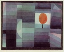
Whether rich or pale, dark or light, contrasting or graded, Klee’s use of colour is gorgeous. From the simplest elements, he laid out colours and lines that look spontaneous, but were usually the result of an almost neurotic care. Many of his works are covered in pen lines or have motifs scratched into the surface: casually intricate lattices, cheerfully meaningless hieroglyphs.
There is a whole repertoire of line-based figures that he used again and again, blocked arrows, skeletal pine trees, rows of arches, asterisk-like stars and more.
Although not an abstract artist, abstraction was fundamental to his painting from an early stage. He pithily summed up the essence of abstraction when he said, “Art does not render the visible, it renders visible.” In other words, the thing that is painted is not the subject of the painting, merely its inspiration.
For Klee, this resulted in a small percentage of purely abstract works, but an otherwise almost complete preoccupation with painting the mysterious and drawing the bizarrely unreal, where rooms are virtual spaces with floating contents, birds are anthropomorphised, and a city can be a series of flimsy surfaces held together by ropes and cables in defiance of gravity.
Technically, Klee never made any claims for himself as a draughtsman. He was refused a place at the Munich Academy as a young man, and paid to study at a private school instead.So it’s interesting to note that the drawings executed on coloured backgrounds, however sparse or subtle, are so much more effective than the solo work with pen or pencil. There’s a worthy attempt to categorise different techniques and styles within the show. Thus we have the magic squares in the first room, the pre-Hoffnungesque pen work over various coloured backgrounds in the next, all the way to the bigger paintings at the end.
Visually, however, the show drifts in the middle as a result. The colour and drama of the first two rooms give way to a series of undistinguished drawings and exercises, including notes and jottings from his years at the Bauhaus.
By the time you have reached the end of the first run of rooms, the initial excitement has been overwritten, and you are faced with one of the artist’s more gnomic utterances stamped on the wall just above eye height. This draws attention to the difference between the individual and the ‘dividual’; it’s a topic that is covered at greater length in the catalogue, but if you’re going to put text on the wall, the goal must be clarity.
In the short climb to the higher floor, the exhibition regains a good deal of its composure, but there is still a sense that this is not always Klee at his best. Lonely Flower, for example, is instantly recognisable as Klee, yet completely devoid of the dynamic magic that makes him special.
Late in life, illness restricted Klee’s ability to move about. He then started working on larger images and a broad brush. Some of these works are displayed in the last room of the exhibition. The text on the wall talks of a new monumentality, but that is an exaggeration.
But the step up in scale undoubtedly suited Klee’s skills. Lines, curves, hieroglyphs and circles are larger, yet still placed in the rectangle with a loving precision. And the relationship to colour is as keen as ever; gradations and complements radiate from different parts of the surface like heat.
The strongest of these are the ones that suggest hidden faces (a favourite Klee motif), Broken Key and Hold, where twin black circles gaze out of their lair, bewildered and apparently powerless. By the time these were painted – 1938-39, Klee was already back in Switzerland, having left Germany in 1933.
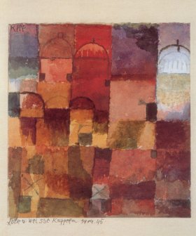
If the show as a whole is inconsistent, it is not short of high points. You’ve seen plenty of reproductions of pictures like Abstraction of a Motif from Hammamet in racks of greetings cards, but the quality of the original watercolour – itself no larger than a greeting card – is stunning, presenting a powerful shimmering impression of North African sunlight and design.
There are surprises throughout, such as the deep, almost Chinese, yellow of View of a Mountain Sanctuary, or the sudden change in the importance of the margin that you can see in A Leaf from the Book of Cities or Dry Cool Garden, where the silver paper highlights the use of silvery greys and dusky pinks in the interior.
These are only a few obvious instances; you’ll easily find others. The darker paintings, for instance, often contain hidden warmth – comfort where you might expect gloom.
It’s more than a decade since the last major exhibition of Klee’s work in London, when the excellent Berggruen collection came to the Tate Gallery at Millbank. The current show can’t match the standards of that one, but it presents many other works, including at least one (Homage to Picasso) whose whereabouts were unknown back in the eighties.